Art for the Living Room
The living room is the heart of the home—where you gather, unwind, and welcome people in. It’s the most lived-in, visible space and often the room that the rest of the home visually connects back to. As a communal area, it’s a chance to put your personality on display. One-of-a-kind art is a natural choice for saying who you are and what you love out loud.
That doesn’t mean the art needs to be dramatic or oversized to feel important. Choosing art for a living room becomes much easier once you understand the wall you’re working with, the scale the room can support, and the kind of atmosphere you want the space to hold. From above-the-sofa sizing to gallery wall layouts, here’s how to choose art that gives your living room a sense of comfort, connection, and character.
Where to Place Art in the Living Room
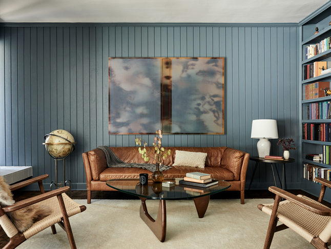
The Sofa Wall
The sofa wall is the most common place to add art in a living room. In most living rooms, the wall above the sofa is where your eye lands first. It’s a strong visual center that provides a clear horizontal line to follow for placement. The art above it can respond to that shape. Even when an artwork itself is vertical, you can gauge the width and weight of the furniture beneath it.
If you’re unsure where to begin placing art in your living room, this is often the safest place to start. Once the sofa wall feels resolved, the rest of the room becomes easier to approach with more confidence.
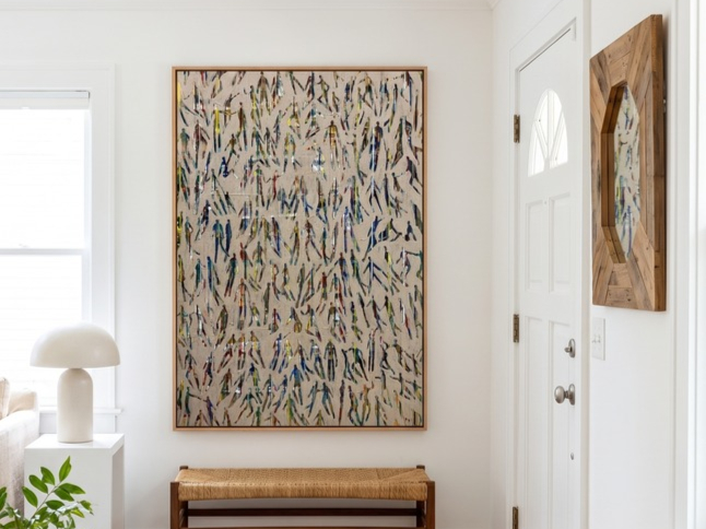
The Standalone Wall
Some of the most interesting opportunities in a living room come from the walls that aren’t tied to furniture. A standalone wall doesn’t have a sofa or mantel setting the scale, which leaves choosing art more open to interpretation. Because there is no built-in reference point, scale decisions need to be intentional. This wall can support a single large work that defines the space, or a more minimal piece that allows the surrounding negative space to become part of the composition.
In open-plan rooms, especially, standalone walls often help establish zones within a larger space. A single piece can signal a shift in function or mood without adding physical separation.
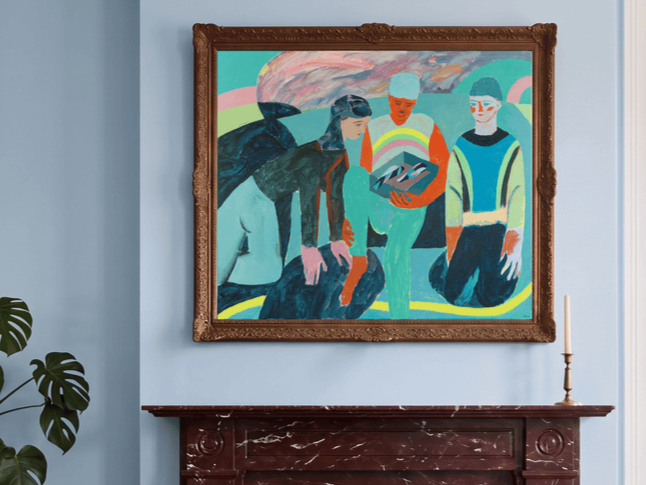
Art Above the Mantel
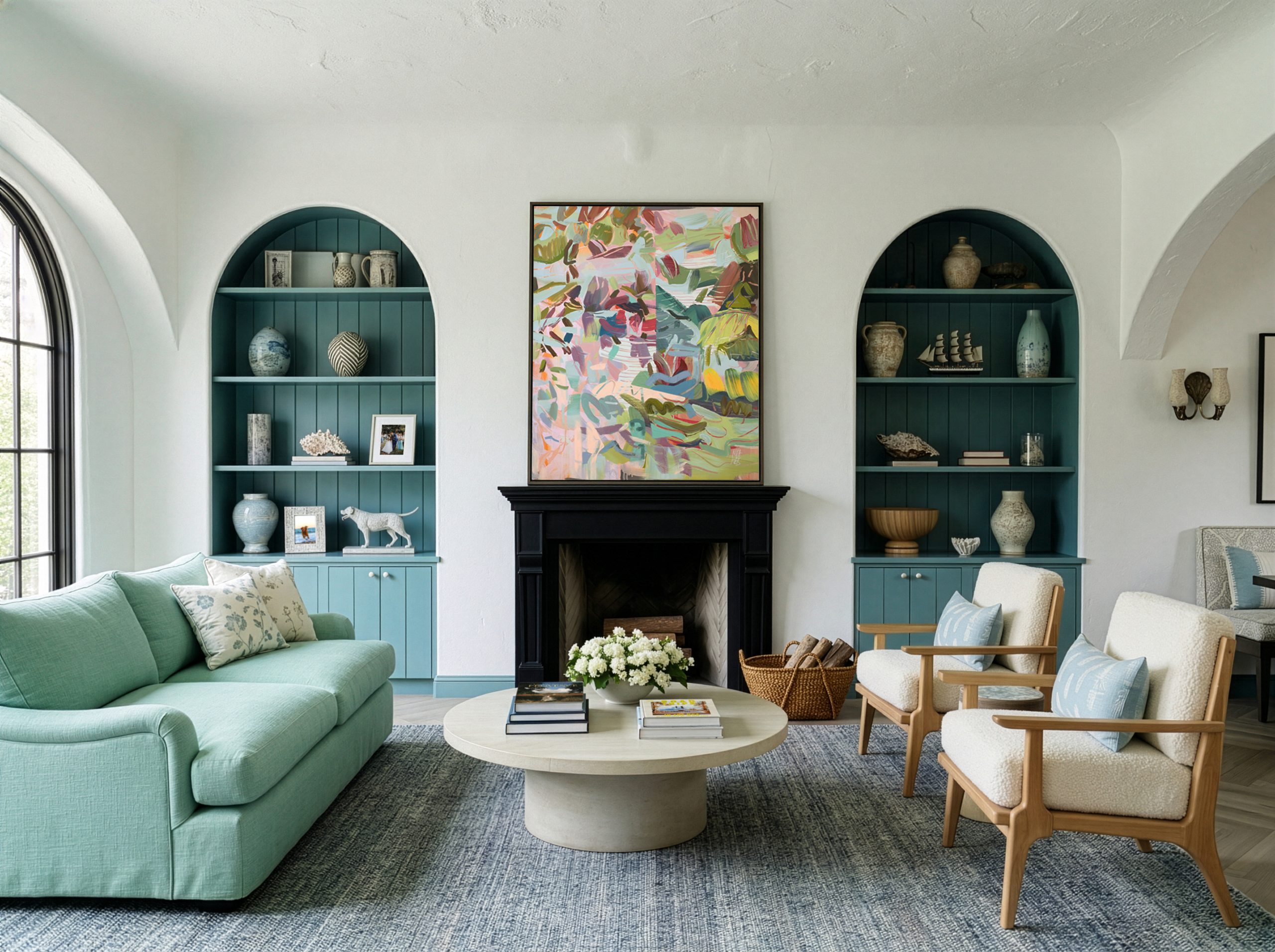
In living rooms with a fireplace, the mantel becomes a natural focal point. Depending on the room’s layout, it may compete with—or sit alongside—the sofa wall as the primary place for art.
What makes this wall distinct is its built-in ledge and strong architectural framing. The mantel creates a clear horizontal boundary. Hanging art above the mantel tends to create a more formal focal point, where the wall reads as a single composed moment. On the other hand, styling the mantel with objects, frames, and collected pieces creates a more layered, lived-in feel.
Both approaches work best when they feel intentional within the fireplace’s architecture, allowing the mantel and the wall above it to read as a single connected visual area rather than as separate zones.
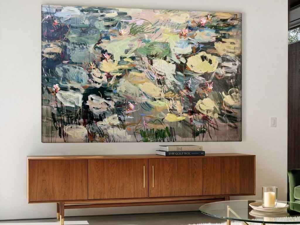
Opposite the Sofa
Once you’re seated, the wall opposite the sofa becomes the primary view. This wall may hold a television or console table, which naturally shifts how art is placed or scaled within the space. You can place art around these elements to fill in space or even hide your TV among art.
It also offers an opportunity to shape the room’s atmosphere. Rather than competing for attention, art here often works best as part of the room’s overall rhythm. Quiet landscapes, photography, or restrained compositions tend to hold up well at a distance and support the experience of the space over time.
In rooms where the sofa wall carries more visual weight, this wall can also help balance the composition—softening the room and creating a more complete visual flow from one side to the other.
Choosing the Right Scale and Layout for Living Room Art
The Statement Piece
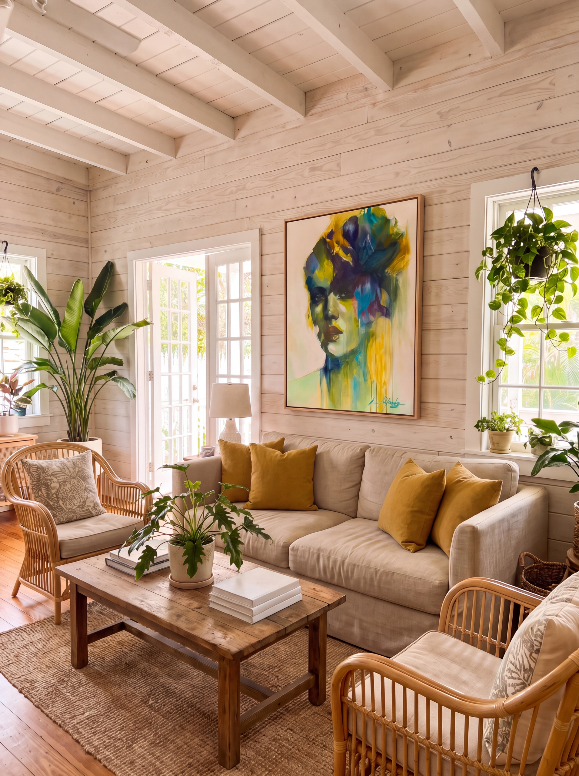
One eye-catching work is the simplest way to approach living room art. A statement piece brings clarity, giving the room a single anchor without the need to coordinate multiple works or build a more complex composition. It’s a natural starting point when a space is still coming together.
It works especially well when:
The most common mistake in choosing a statement piece is going too small.
Above a sofa, art should generally span about two-thirds to three-quarters of the sofa’s width. For a standard 84-inch sofa, that usually means a work roughly 56 to 63 inches wide.
Above a mantel, the piece should span roughly 75–90% of the mantel width.
For standalone walls, a single work that occupies around 60–75% of the available wall width usually feels appropriately scaled.
The Gallery Wall
A gallery wall is a way of hanging multiple artworks together as a single, cohesive arrangement rather than as individual pieces. A successful gallery wall reads as a single visual moment, not a collection of separate objects.
The difference between a gallery wall that feels intentional and one that feels cluttered comes down to curating.
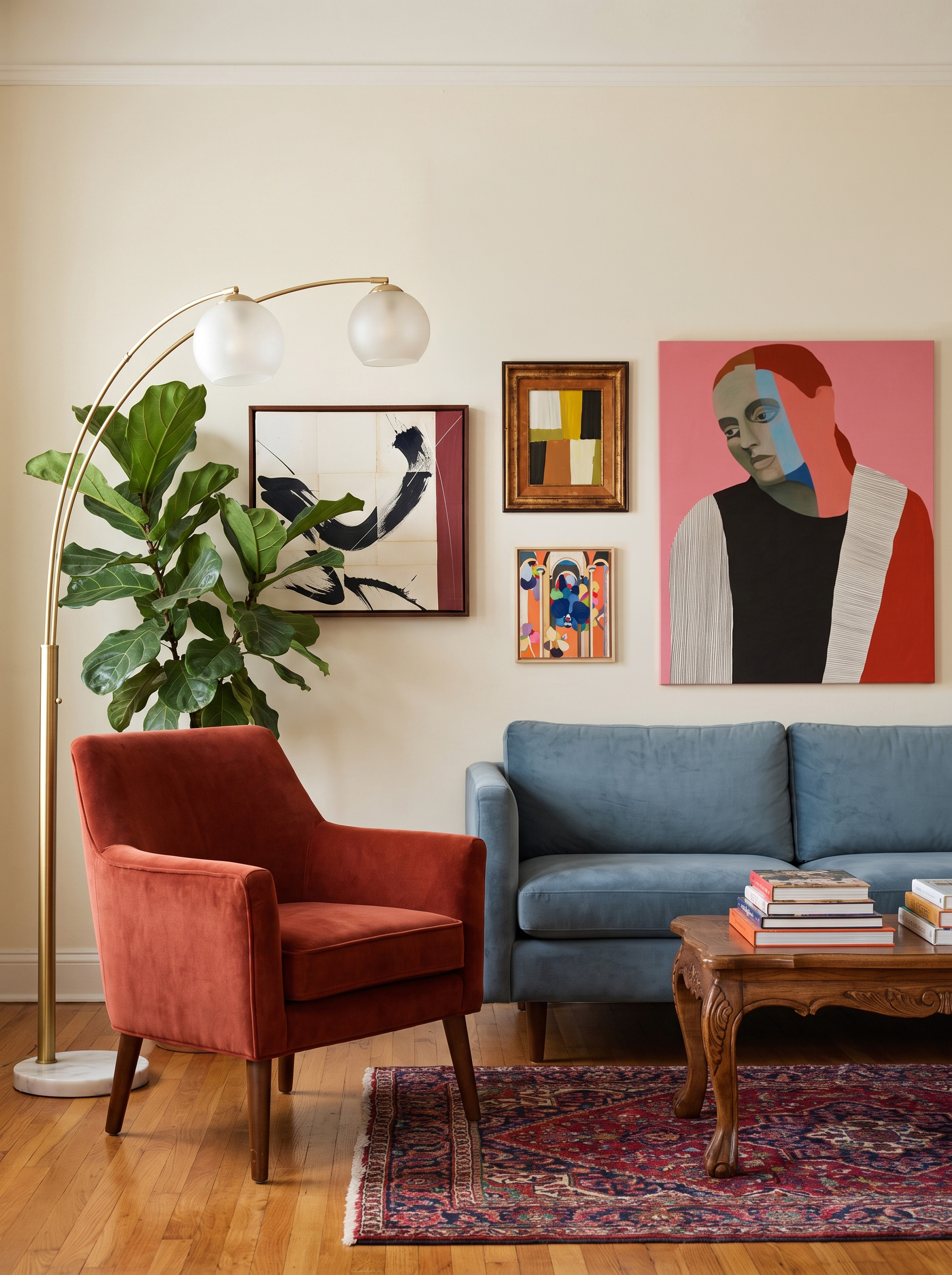
If you’re intimidated by building a gallery wall, these tricks will help you get started.
Start with the largest piece in your collection slightly off-center, then build outward. Symmetry creates a more formal feeling; asymmetry feels more relaxed and collected over time.
Keeping pieces roughly 2–3 inches apart helps the arrangement hold together visually. Once spacing becomes too wide, the eye stops reading the grouping as one unified moment.
Framing doesn’t need to match perfectly, but you can relate the pieces through tone, material, or matting. If you want an eclectic look, opt for a mix of frame styles.
Expert Tip: Before hanging, lay the entire arrangement out on the floor and photograph it. Seeing the composition flattened into an image makes the imbalance much easier to spot.
The Diptych and Triptych
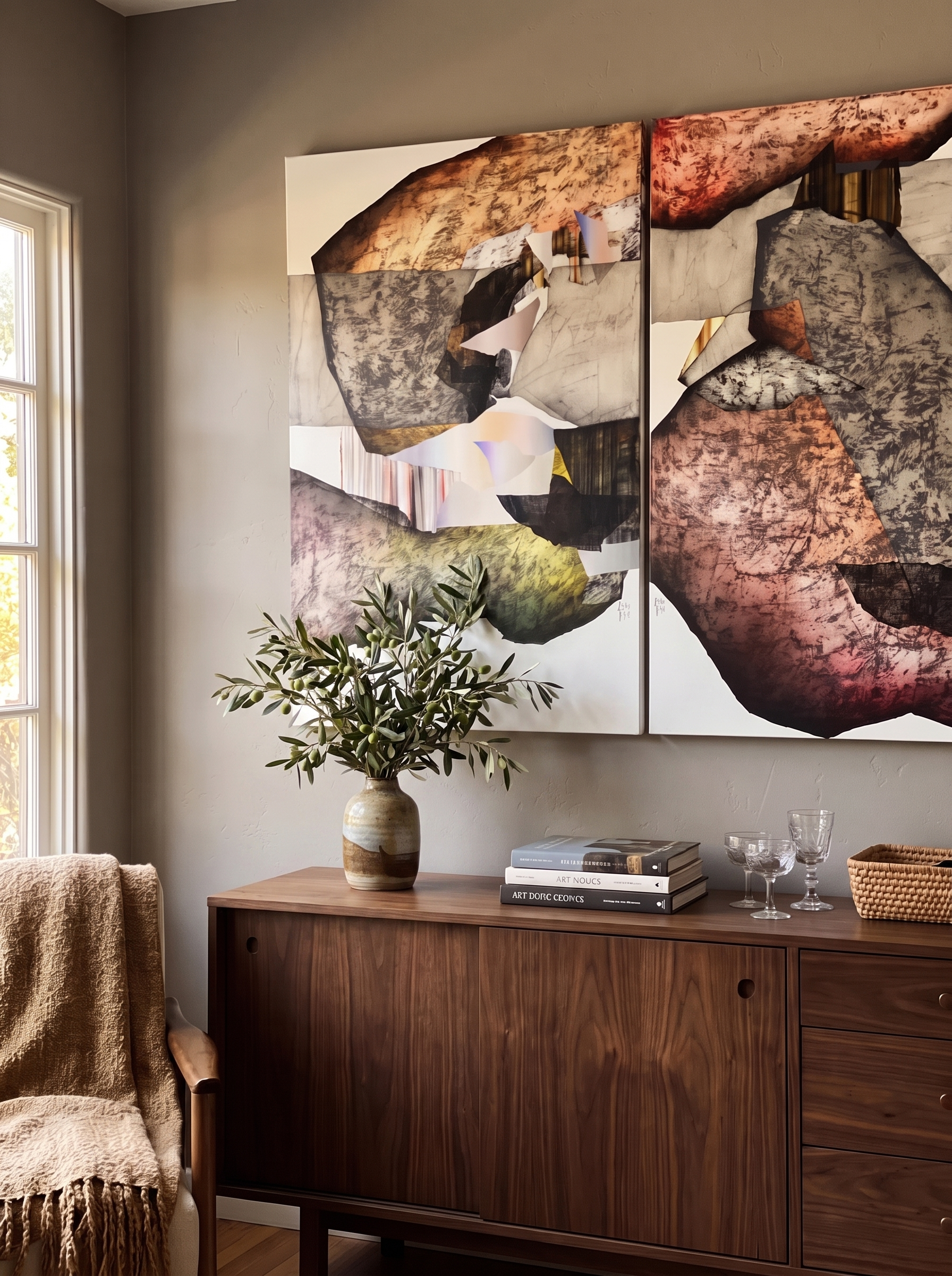
Diptychs and triptychs are artworks made up of panels or separate canvases, either two or three. When the panels are put together, the artist intends for them to be read as a single, unified composition. They sit between a statement piece and a gallery wall, offering the presence of a larger work with a more layered feel.
They work especially well when:
How they read visually depends on spacing. Tighter spacing (1–2 inches) makes the works feel closer to a single continuous image, while wider spacing (3–4 inches) allows each piece to remain distinct while still reading as part of a set.
While artists will often sell diptychs and triptychs as a single work, you can also buy separate works and make your own. When buying pieces independently, coherence is key. Similar palettes, related subject matter, or works by the same artist help the grouping feel intentional.
Hanging Art in the Living Room
Once the arrangement is chosen, hanging becomes about placement and alignment.
Height
For most living rooms, the artwork should be centered at around 57–60 inches above the floor. This creates a consistent eye level whether the work is viewed while standing or moving through the space.
Above a sofa, the most important relationship is between the bottom of the frame and the top of the furniture. Keeping a consistent gap (typically around 6–8 inches) helps the art feel visually connected to the sofa rather than floating independently on the wall.
In rooms with high ceilings, it can be tempting to hang art higher to “fill” the wall. Maintaining a consistent eye-level placement usually creates a stronger sense of balance than following ceiling height alone.
Alignment
Horizontal arrangements should be centered in relation to the furniture below them. Remember that art is read in relation to the sofa, console, or mantel—not the wall itself. A slight shift off-center is immediately noticeable, especially in multi-artwork arrangements.
When there is no furniture to anchor a piece to, you can default to aligning any artworks with the room’s primary sightlines.
For diptychs and triptychs, treat the grouping as a single visual block. Measure the full width, including spacing, and center that total width over the furniture beneath it.
Installation
Before committing to placement, the painter’s tape method is a useful way to test scale and positioning directly on the wall. It allows you to adjust proportions in context before making holes.
For multi-piece arrangements, paper templates can help map out spacing and alignment before installation. This is especially useful when working with gallery walls or grouped compositions.
For unframed canvases or lighter works, leaning can also be a valid alternative to hanging—particularly on consoles, shelves, or in more informal spaces where flexibility is preferred.
Art Styles and Mediums That Work in the Living Room

Bold Abstracts
Abstract art works particularly well in living rooms because they leave room for interpretation. There’s no scene to read and no subject to name, just color, movement, and gesture. In a space where different people gather in different moods, an abstract doesn’t tell anyone how to feel; it sets a charge in the air and lets each person meet it on their own terms.
Not all bold abstracts function the same way. Some rely on color saturation and contrast; others create energy through movement, texture, or gesture. Start paying attention to which type of composition you respond to to help narrow your search.
Large-scale oil and acrylic paintings with visible brushwork or palette-knife texture lend a room physical presence. Mixed media works add tactile complexity that changes throughout the day as light moves across the surface. For more minimal interiors, large-format abstract photography can create the same sense of scale and atmosphere with a cleaner visual language.
Figurative Art
A face on the wall changes a room differently than abstraction does. Where an abstract sets a mood, figurative art introduces narrative, psychology, and emotional presence.
How that presence feels depends on the work. Figure studies tend to feel intimate and observational, while narrative scenes feel more theatrical and layered. Contemporary figurative painting often sits somewhere between the two—looser, more expressive, and especially strong in modern interiors. Traditional oil portraiture brings a sense of history.
For minimal living rooms, drawings and works on paper can offer the emotional pull of figurative art without the visual weight of a large painting.

Natural Landscapes
Of all the art you can hang, a landscape is the one most likely to take you somewhere. A coastline, a field at dusk, or a fog-soft mountain carries a sense of place that can comfort as you unwind.
Not that every landscape feels the same. Soft, atmospheric scenes with diffused light settle a space and make it feel unhurried, while sharper, high-contrast work feels more vivid and awake. The shape guides placement: horizontal pieces reinforce the line of a sofa wall, and vertical ones draw the eye up in tighter spaces.
In a landscape, oil paint’s slow blending lends itself to luminous light and soft, atmospheric horizons, while acrylic’s quick-drying crispness brings cleaner edges and brighter color. Large-format photography works especially well in contemporary interiors where cleaner lines dominate the furniture and architecture. Watercolors and works on paper create a lighter visual presence, making them particularly effective within gallery walls or layered arrangements.
Shop Art for the Living Room
Explore original paintings, photography, and sculpture for the room where life happens, and make it feel like yours.