Art for Small Spaces
In a small space, the walls can become an afterthought. The space might feel temporary, or simply too small to be worth the effort, so function comes first, personalization comes later, and the result is art that just fills the space, if it’s added at all.
But the answer to a small space isn’t avoiding art, or only going small. Because there’s less room to work with, every piece carries more weight. A single work can define a space more clearly than several smaller ones, and the negative space around it becomes just as important as the art itself.
Choosing art for a small space, whether it’s your whole home or a single corner of it, is less about working around its limits than about knowing where clarity, restraint, and confidence matter most. Done with intention, even the smallest space can feel like you.
Where Art Goes in Small Spaces
Small spaces don’t have excess wall footage to work with, so placement has to be deliberate. Each wall often has more than one job: to define function, create atmosphere, and guide how the space is experienced.
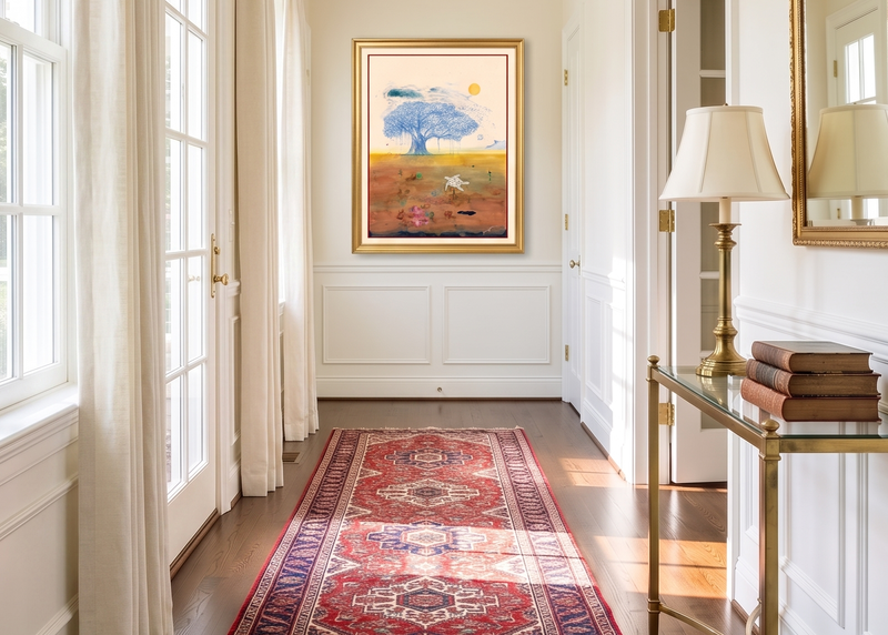
The Narrow Wall
Hallways, entryways, and tight transitional walls are some of the most common small-space challenges. Instead of thinking width, think height.
Vertical or square orientations are the natural answer—they work with the proportions rather than fighting them, and they draw the eye upward, which lifts spaces that tend to feel low and boxed in. A single, well-chosen piece often works better here than multiple smaller works, which can make the wall feel visually fragmented.
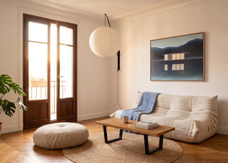
The Central Wall
This is the focal-point wall in a small broken-up space or an open-plan living area. As the longest uninterrupted wall, it’s a prime visual moment.
This is where the scale paradox comes into play: a single confident work can make the space feel larger. While the instinct is to play it safe and go small. The right move is almost always the opposite: treat it like any focal-point wall and scale the art accordingly.
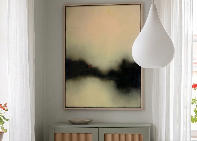
The Nook
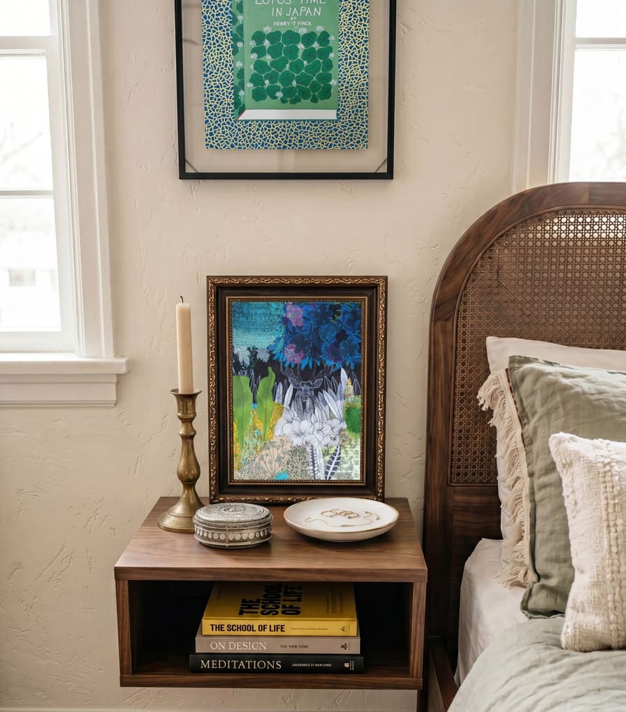
Reading nooks, breakfast corners, window seats, and alcoves are contained little pockets that already feel like their own moment. Of all the small-space placements, the nook is the one that most rewards intimate scale. You’re physically close to the wall and usually seated.
Art here should reward the close, unhurried look a nook invites: a single small work at seated eye level, a piece leaned on a narrow shelf, a work on paper in a simple frame. It is the right place to take a risk, something personal or unexpected.
Choosing the Right Scale and Layout for Small Spaces
Scale works differently in small spaces. Rather than trying to visually expand every wall, the goal is to choose moments where scale is either intentional or intentionally restrained.
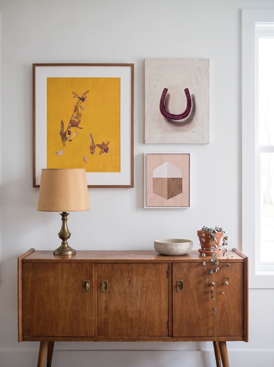
Intimate-Sized Artworks
In small spaces, smaller works strategically placed or grouped together are the most straightforward choice. An intimate single work will feel at home in small places, as the setting is where it can be experienced closely. With the right placement, you can highlight material qualities such as texture, detail, and surface variation that might be lost in larger rooms. This approach works particularly well when you want the space to feel personal.
On scale, there’s no hard rule, but artworks around 8 to 18 inches on the shorter side suit most nook and narrow-wall placements.
The Statement Piece
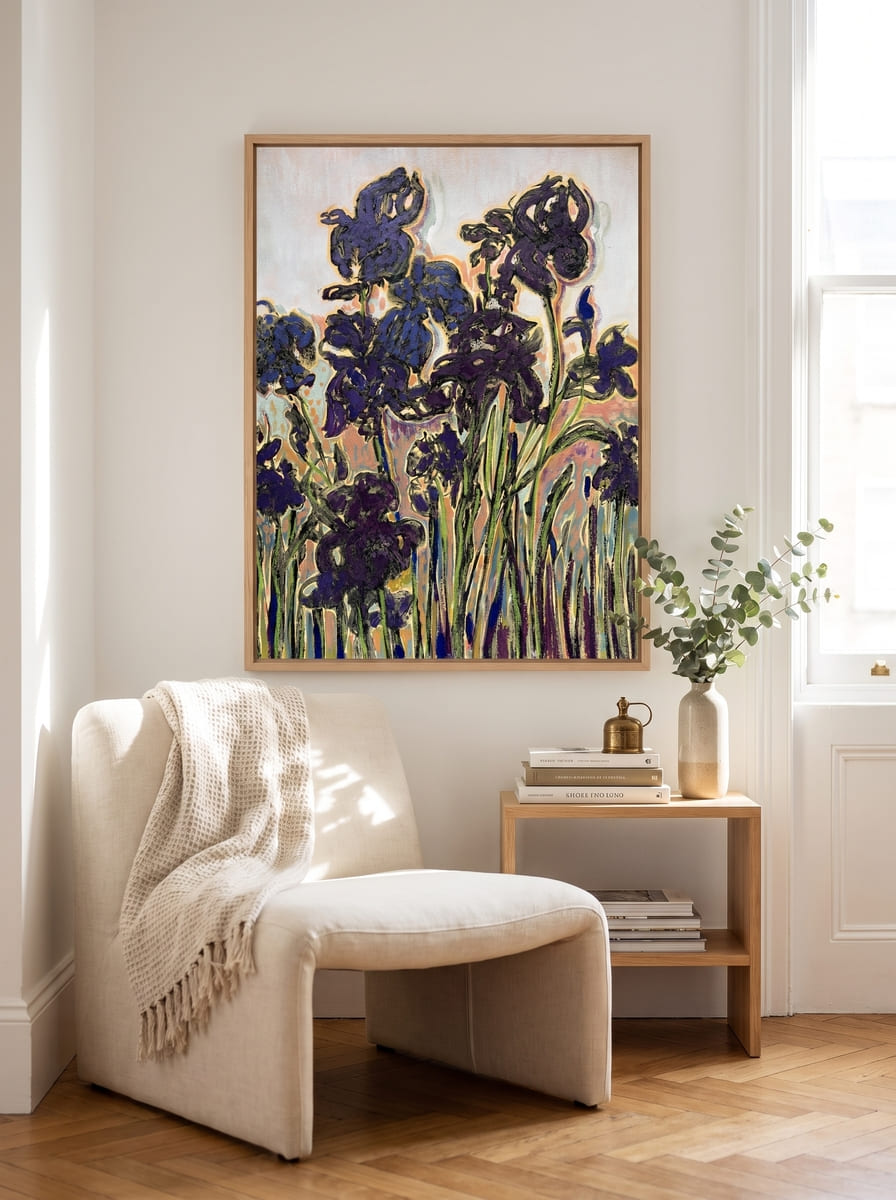
There’s a common misconception that small rooms require small art. In some cases, the opposite can be true. A well-scaled statement piece can reduce visual fragmentation and give the room a clear focal point. This does not necessarily mean a large piece, but a confident one. A work with the compositional presence to hold the eye on its own.
The key is proportion. Even in small rooms, art should relate to the wall or furniture it sits above rather than the overall room size.
The Gallery Wall
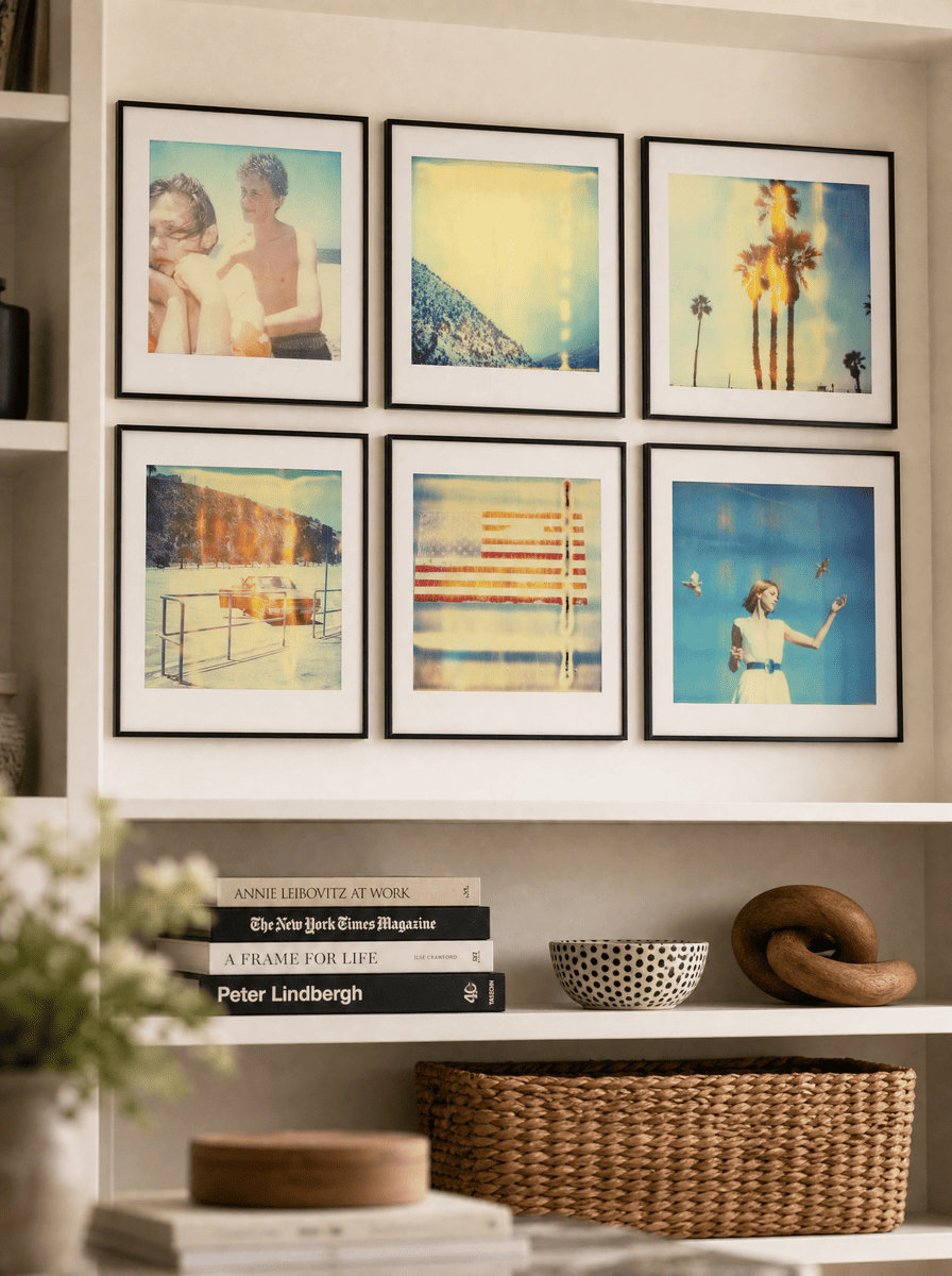
Gallery walls can work in small spaces, but they require more restraint than in larger rooms.
Because visual space is limited, the difference between clean and cluttered is more noticeable. Successful small-space gallery walls tend to share a few traits: consistent spacing, a clear outer boundary, and a strong sense of cohesion between pieces.
They work best when they function as a single visual unit rather than a collection of individual works competing for attention.
Art Styles and Mediums That Work in Small Spaces
Small spaces benefit from clarity in composition and subject matter. The goal is not to reduce visual interest, but to avoid unnecessary visual noise.

Works That Open the Space
Choose light, airy artwork to create breathing room. Open sky landscapes or minimal abstracts in neutral-to-warm tones allow the eye to move through the image rather than stopping abruptly, which helps a room feel less compressed.
By medium. Wide-format landscape or aerial photography is especially strong here. Its tonal range creates depth that reads clearly even at small sizes. In painting, loose, atmospheric oils or acrylics with an open horizon or soft ground achieve the same effect.

Works That Make a Statement
In small spaces, a statement piece defines a home. High contrast, strong composition, or bold color can give a compact space a clear identity. Instead of feeling overwhelming, strong work can actually reduce visual noise by establishing focus. This approach is most effective on primary walls where the eye naturally lands first.
By medium. Impasto, palette-knife, or confident gestural oil and acrylic read as energy. Layered mixed media with a strong compositional structure suit more eclectic or maximalist small rooms. And high-contrast, graphic photography delivers impact at sizes that fit smaller walls.

Works That Reward a Closer Look
Small spaces bring the viewer physically closer to the artwork than larger rooms do. This makes detail important. Detailed, tactile, or complex work that gives up its detail only at close range makes for great options when you’re tight on space.
By medium. Works on paper—drawing, printmaking, watercolor, ink—suit intimate scale and reward a close look. Small-format oils and acrylics show their brushwork and surface texture best at this range. Small sculptures placed on shelves make for unexpected moments.
Hanging Art in the Small Spaces
With the piece and its spot chosen, the rest is practical: picking the right height and ensuring it is settled before you commit to the nail in the wall.
Height
The standard rule holds for walls you view while standing: center the work 57 to 60 inches from the floor.
For nooks and other seated spots, you may want to drop lower—48 to 54 inches—so the art meets your eye at rest rather than asking you to look up. On a narrow wall, where a vertical format is already pulling the eye upward, hang so the bottom of the piece clears any console or furniture below it by 6 to 8 inches, the same logic as hanging above a sofa.
Leaning and Flexibility
Leaning art on shelves, consoles, or window ledges is especially useful in small spaces.
It allows for flexibility without committing to permanent placement, which is often helpful in multi-use rooms. It also softens the overall visual structure of the space, making it feel more lived-in and less rigid.
Vertical Placement
Stacking artwork up rather than out is a smart choice for tall or narrow walls, for rooms with low ceilings that could use some lift, or anywhere you want to follow a vertical line already in the architecture—a doorway, a tall window, or a column.
Keep the vertical gaps consistent and fairly tight, around 2 to 4 inches, since even spacing is what turns separate works into a single line. Line the pieces up on a shared center so the column has a clear spine. Same-size works make the cleanest stack, though graduating them larger at the bottom and smaller toward the top can feel more dynamic, as long as the centers still align.
When the wall is very narrow (under 18 inches), the frame starts to matter as much as the image: a slim-framed work on paper, or a frameless float, takes up less visual width than a deep-framed canvas, and keeps a tight wall from feeling boxed in.
Framing
On a very narrow wall—under 18 inches—a frame’s depth matters as much as its width. A deep frame projects off the wall and casts shadow, adding bulk that crowds an already-tight space, while a slim frame or a frameless float sits flatter and keeps the wall from feeling boxed in.
Shop Art for Small Spaces
Explore original paintings, photography, and works on paper chosen to make a small space feel bigger, brighter, and entirely your own.